If you're having trouble deciding on a color combination, check out Bliss Weddings Color Palette Tool for inspiration.
Another great place to look for inspiration - Stationary. That's right, if you like going to a stationary store for kicks, why not channel your inner notecard obsession for good use.
Some favorites:
Paper Source. Just looking through the wedding section of the site makes me inspired to take on way too many DIY projects.
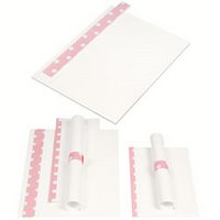
I mean look at this beautiful pink polka dot program set.
Or these cherry red custom letter press invitations. OK, so I see a polka dot theme emerging.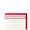
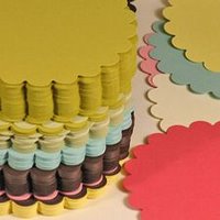
Another sure bet for inspiration is Kate's Paperie. I visited their store in SoHo last month while in New York and probably could have spent a few days there. I mean I spent about 30 minutes just staring at their selection of the Crane's Kate Spade Christmas Cards. But, just look at these cute scallop circle cards. Even more, look at the selection of colors.
Kate's and Paper Source can not only help you pick your color scheme, but then you can consistently carry those colors through the wedding. Both shops can help you with invitations, programs, favors, placecards, the list goes on and on. And everything will match.
Did I mention my Southern mother. Matching, my friends, is pretty much the 11th commandment when it comes to my mother!


No comments:
Post a Comment